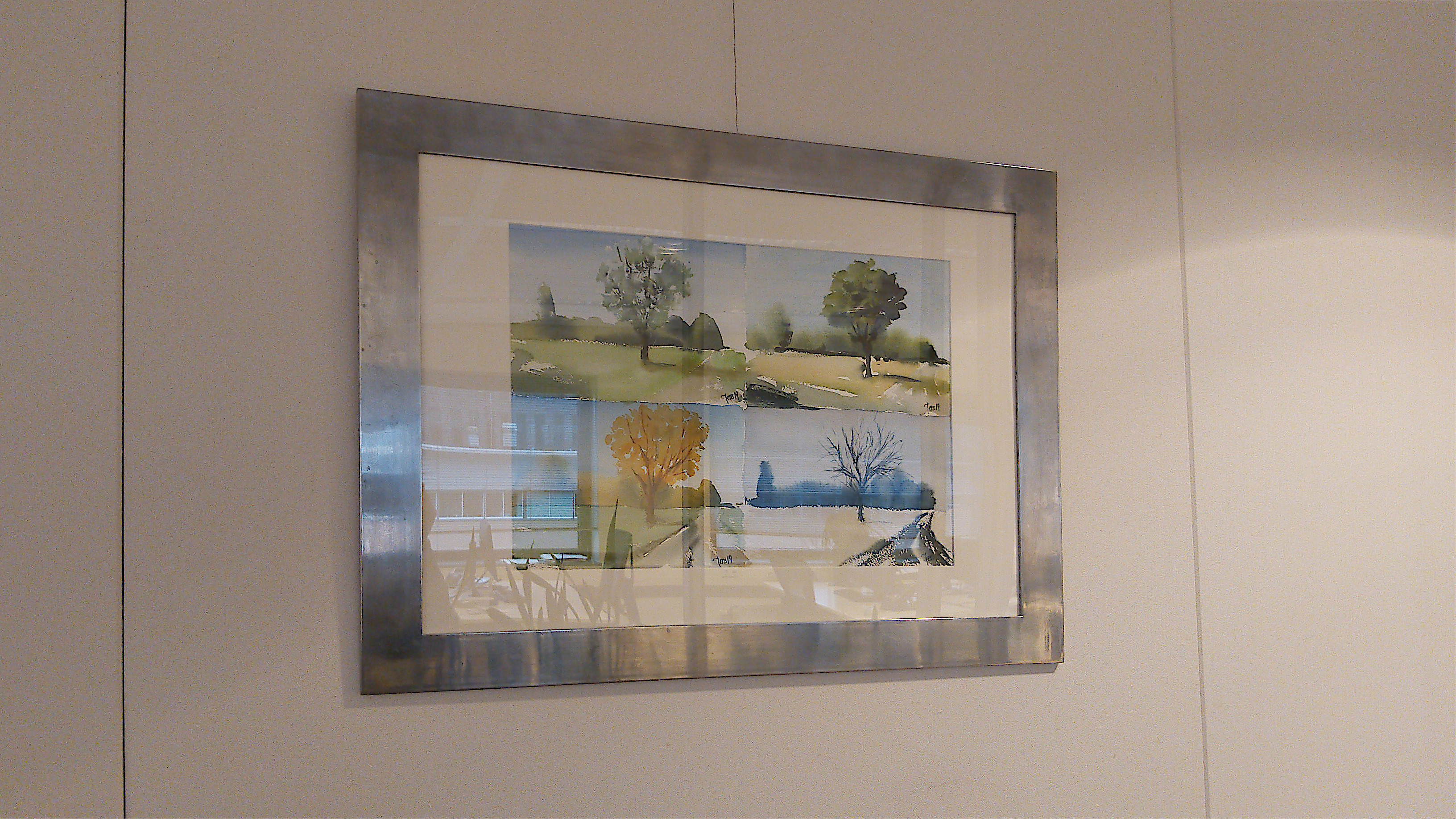
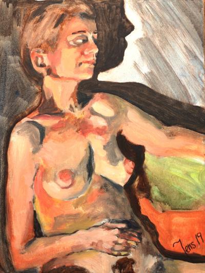
| Painting of Sunnerås 21 November 2019 |
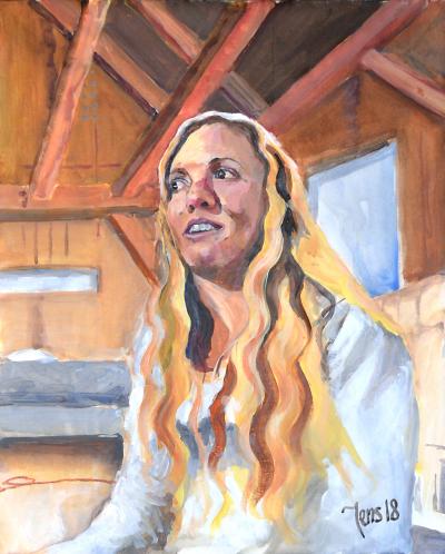
Portrait of Elsie Luna |
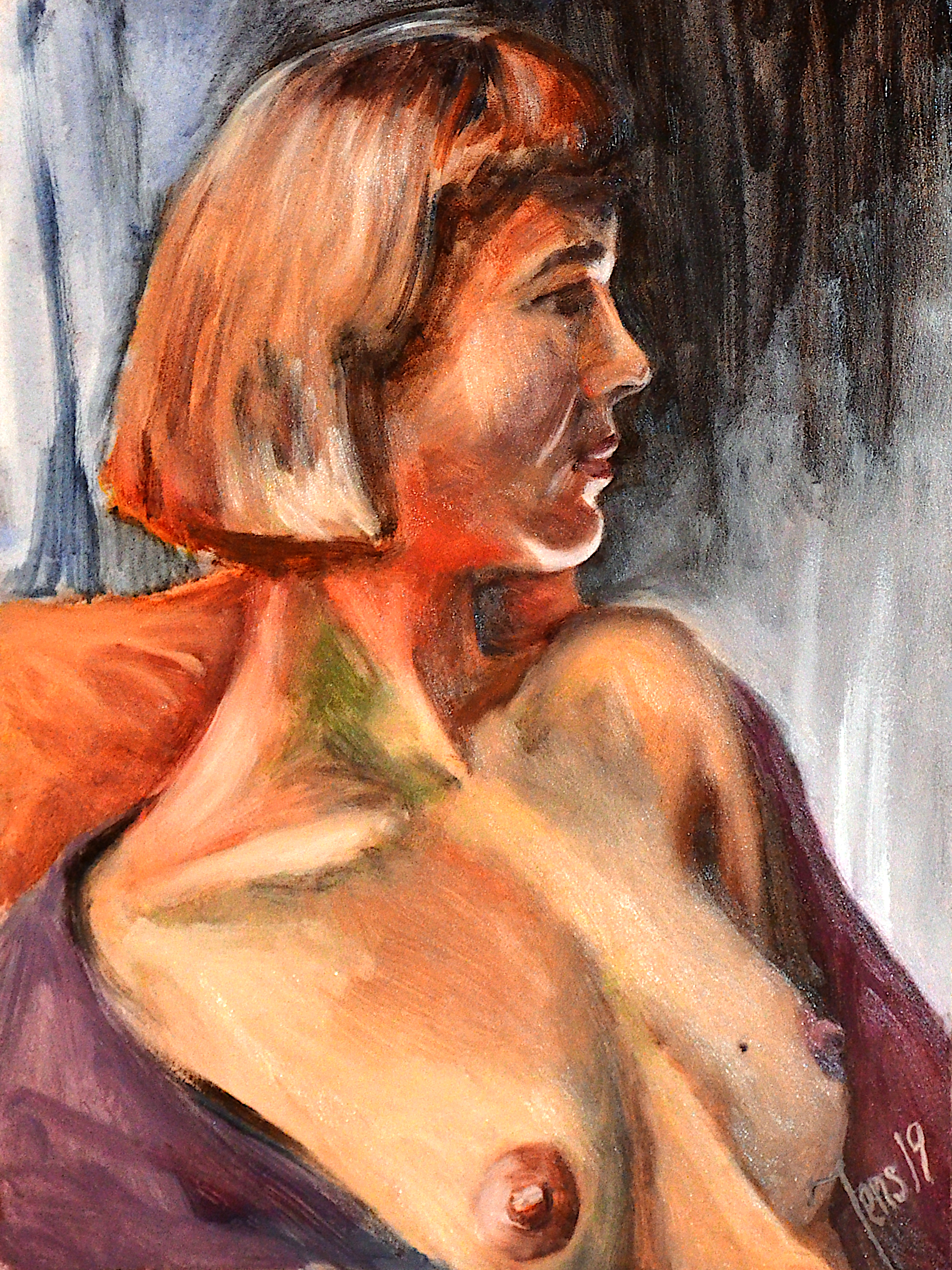
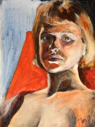
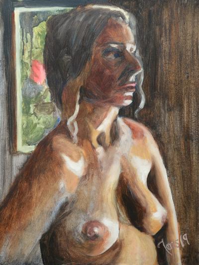
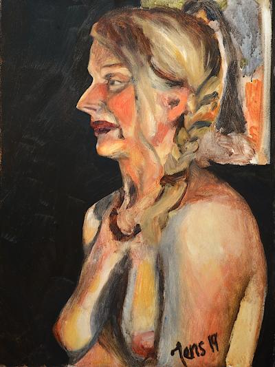
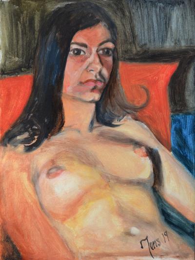
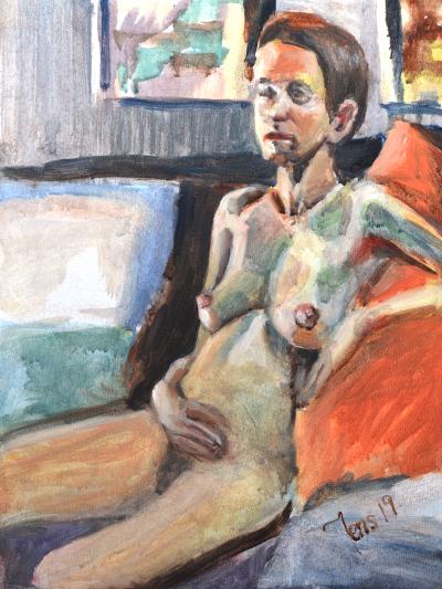
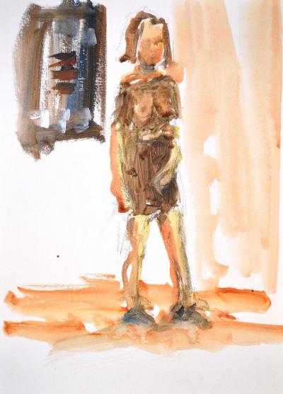
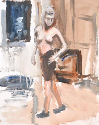
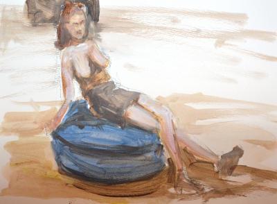
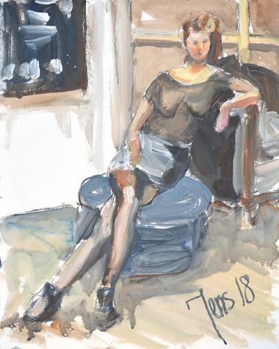
Eivor 24 November 2019
 It is Sunday 24 November 2019, and I am on my way to life model painting in Amsterdam. It is a mild sunny day with a thin overcast.
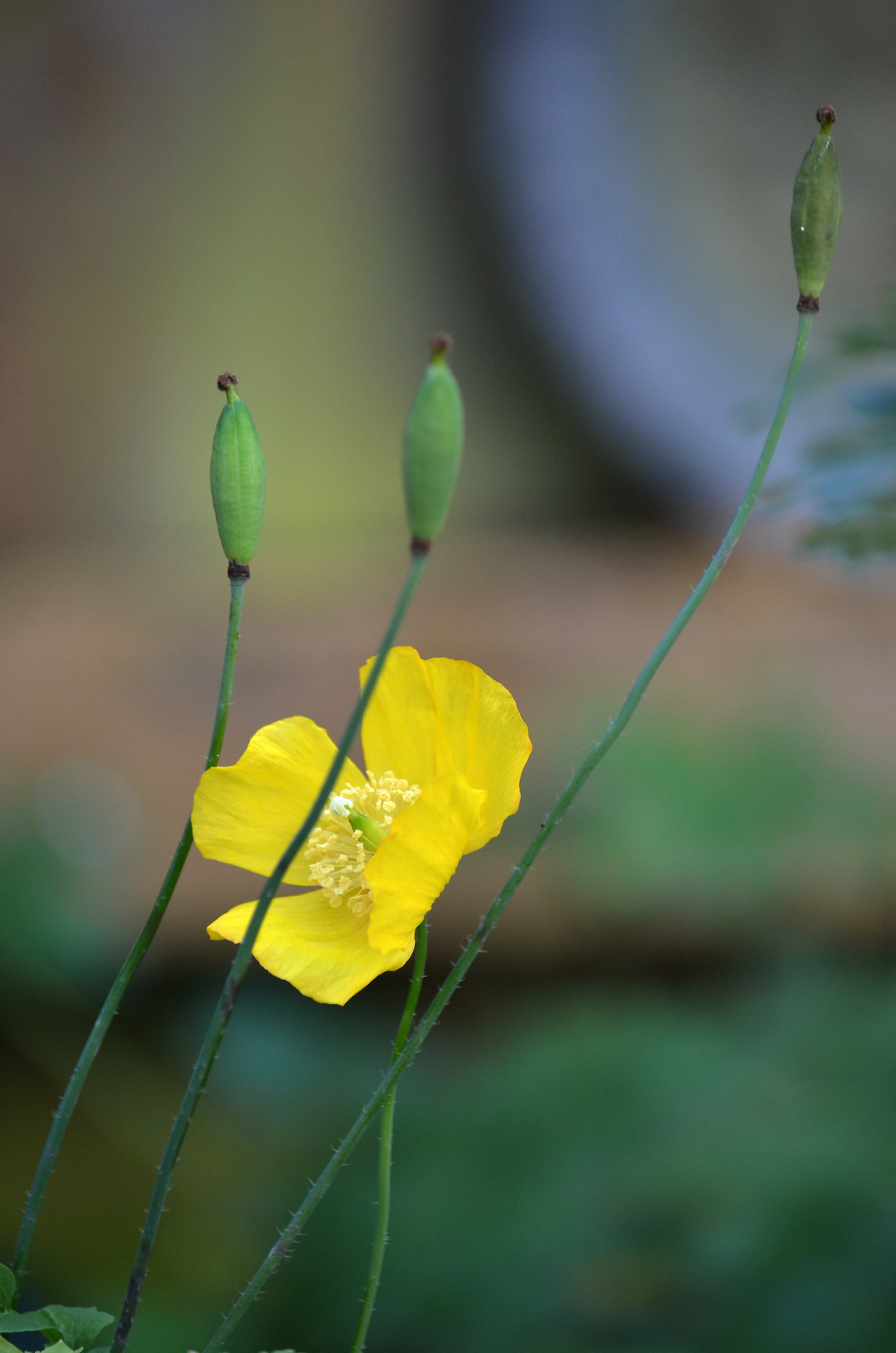
This morning I discovered a flowering poppy in my garden. I cannot recall I have ever seen it flower in late November. I tried to find information on the Internet about the flowering season, but that is difficult to pinpoint. There exists a poppy variation called Iceland poppy, and it can flower in September. That variation was lower. My poppy is almost 50 cm high. I could find notes on that if you cut the stems of the plant and then it might come back later in the year.
When I search like this, I feel lost in information and variations of poppies and their seasons and whatnot. In the end, that feeling that I have not seen a flowering poppy ever this late in the year, that feeling is undermined. Perhaps I have? However, for me, a flowering poppy in November stays with me like a symbol for the time we live in. Climate changes. I took a couple of pictures of the flower. I can even try to paint it as part of my series about climate activists.
Now we arrived in Amsterdam. From here, I will take tram 13 to the studio. Today it is the final session of painting Eivor.
At the studio, there was an opening of a new exhibition. Marina Dielen had a vernissage for her ceramic art. It was really nice. She uses salt but also oxides for her glazing.
When unpacking my things at the studio, I realized I had forgotten to wash my brushes last week! The only fortunate things were that I had used an unusually small amount of brushes last time, three. Many times I end up with nine brushes or more. The reason for this is that I am using the Cobra paint, and it contains water, and eventually, the water reacts with the pig hair brushes, makes them curl the brushes. My solution to this is to have more brushes.
Today I had the place Chef had last time, and from here, I painted her face in silhouette. She still had the incandescent lamp from the right side, and from this place, it lit up her forehead, nose, lips, and cheeks. The lamp from the other side had a warmer light.
The artists today were Floor, Lydia, Saskia, Ron, and me.
I had a great time painting Eivor today. Painters happiness.
On my way home, I got on my favorite train, and it was not full. I could sit. At home, I washed the brushes first, so I did. Then I placed the three paintings of Eivor next to each other to have a look. 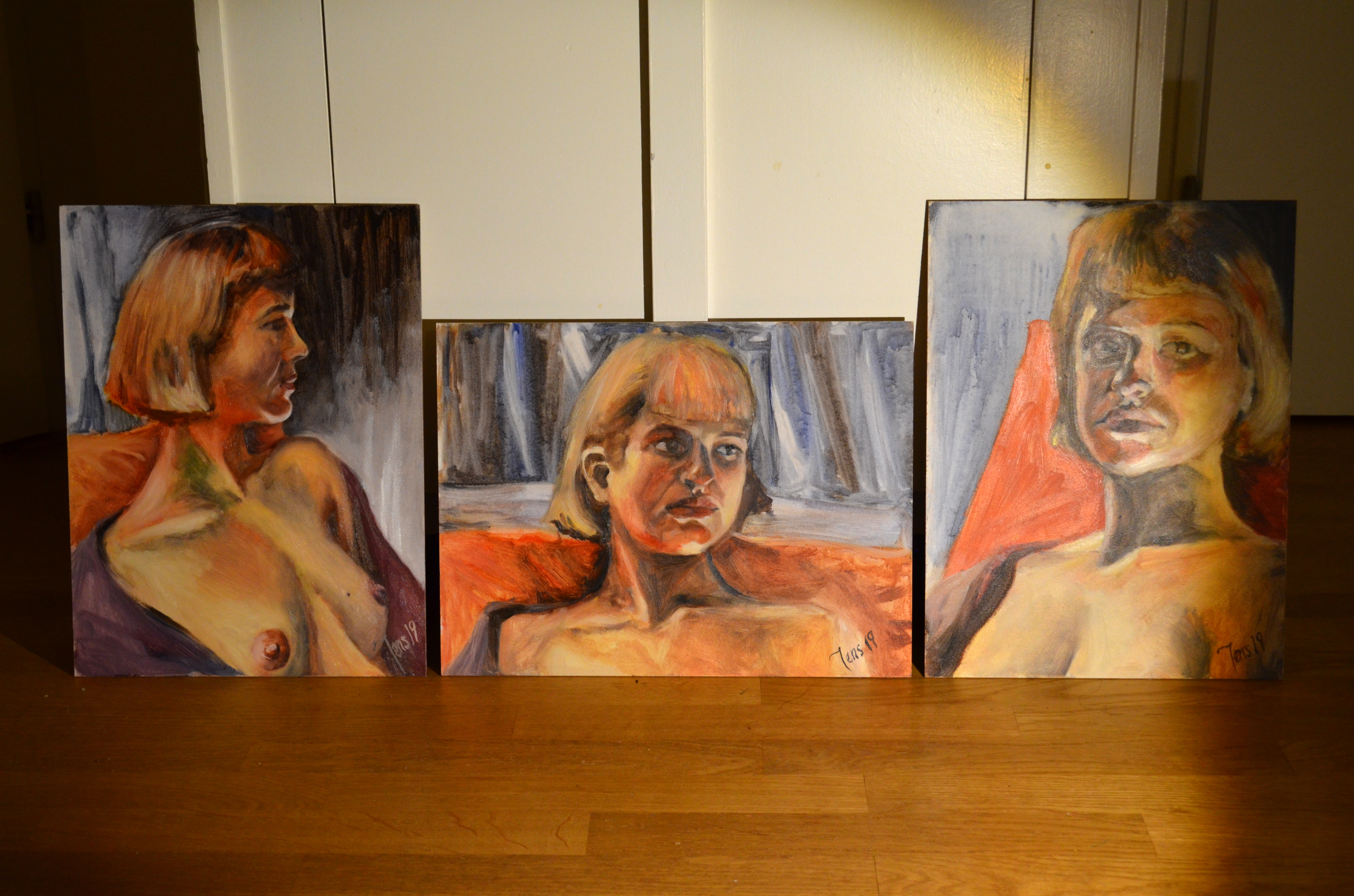
I am happy with the result. Now I will tell you how I take a photo of a wet oil painting.
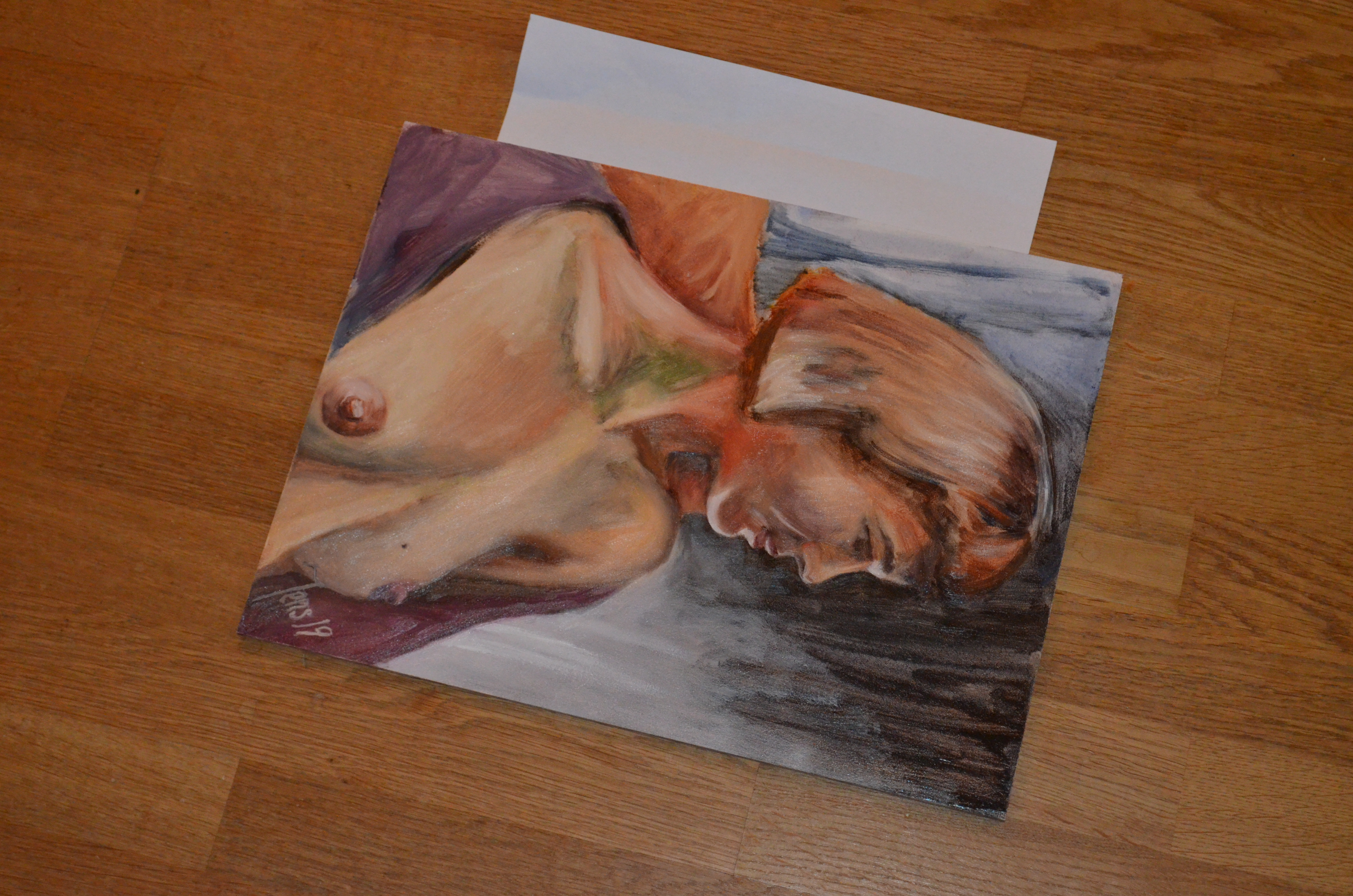
I normally place the painting on the floor. Then I take a photo with my 18 – 55 mm lens on my Nikon 5100 camera without a tripod. It is better to use a tripod for better quality. I try different lighting. Usually, I try to take the image at 45 mm. If it is in the evening, I use flash mounted on the camera. If it is over the day, I can do it without flash. This time I used the flash. To avoid glare, I take the image from the side. A good bit from the side makes the glare go away. In this case, when looking really close, there is some glare left, but it is mostly available in the light section on the right side of the model. I always put a white paper next to the painting. I will come back to the use of that in a moment.
For editing the photo, I use GIMP. It is a shareware program for editing images. Highly recommended.
In GIMP, I use the perspective tool. Shift – P. The tool starts integrated into the canvas. I always pop up the tool into a dialog box.
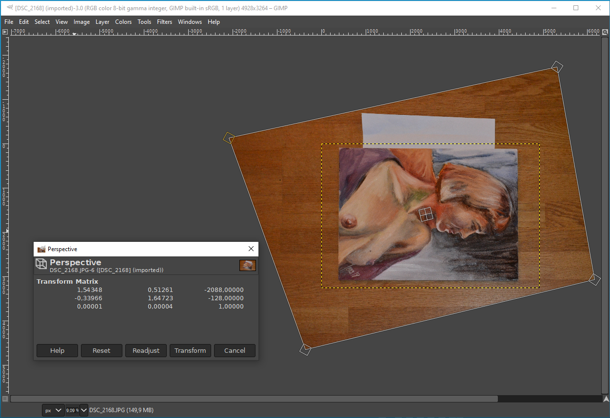
With the dialog popped up, it is possible to align the edges of the image to the dialog. That way, I know for sure that the aligned edges are fine. The result is a bit elongated. That will be fixed in a later step.
When I press transform, it will warp the image into a photo as if it was taken straight from above. Without much of the glare.
In the next step, I correct the colors. For this, I select colors and then levels. It looks like this, more or less.
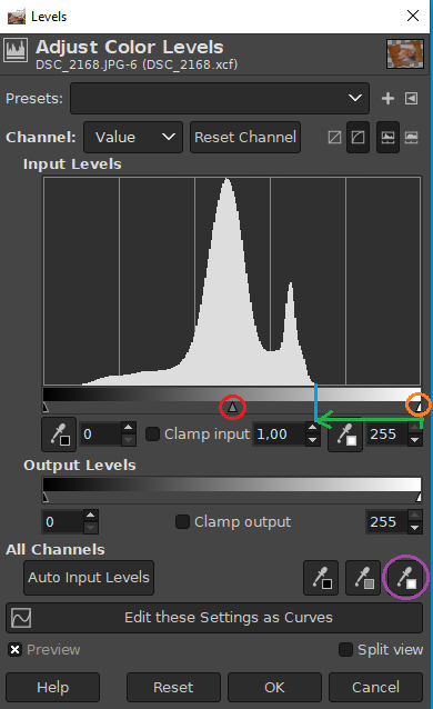
Do you see the half triangle in the orange circle? It should be dragged to the beginning of the histogram at the blue line. When doing that every photo is popping out, it is a magical tool. When done click ok. Then open the dialog again. The next tool is the auto input level droplet, especially the white. I marked it with a purple circle. I click that circle and aim at the white paper that I placed next to the painting. This usually corrects the colors of the painting to be as you expect them to be. The final touch is the balance between dark and light. Drag the triangle in the red circle to the right. At some point, you will find the correct representation of your image on the screen as you painted it. Click ok.
In the next step, I will need to readjust the image for correct proportions. To do that, I open the tool options window. Then I select the rectangular selection tool. In my case, I know I made the panels 30 by 40 cm. If I bought an aquarelle paper, then I look up its size on the cover. It does not matter if it is inches or centimeters, it is about the aspect ratio.
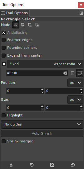
I make sure it is fixed and that the orientation is set correctly. With this, I make a selection.
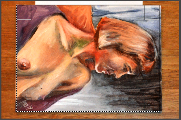
If the selection is not lining up with the painting, then the painting has got an incorrect aspect ratio during the perspective transformation. To correct this, I deselect the selection. Then I select the scale tool. It looks like a small rectangle with an arrow to a big arrow. To do this correctly, I need to "remember" the error. Sometimes I need to do this in several steps.
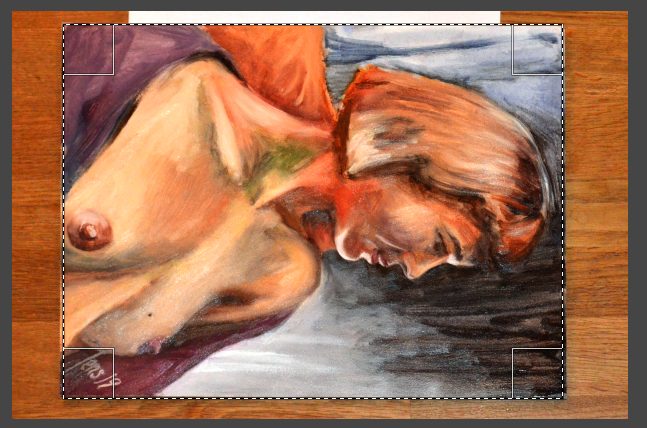
When the scaling has matched up the selection tool will cover the painting perfectly.
At this point, I select the crop to selection in the image menu. Then I turn the image 90 degrees counterclockwise.
In the final step, in the Filters menu, I select enhance and then Sharpen (Unsharp Mask)...
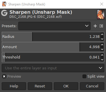
This needs to be set entirely after taste. It is very easy to ruin the image of the painting with this tool. Done correctly, it makes the image pop even more.
The idea of this tool is to find edges in the painting. Then if the edge has a light side and a dark side, then the light side is made lighter, and the dark is made darker. This trick fools the brain to think the image is sharper. It is actually not. It can only be sharper if you use a tripod and a better camera. What it does though, is that it inserts a greater definition. This is why this has to be done by taste. Since it is my painting and I decide how this will look, I am fine with this.
That is it. Here is the final result.

 Suzana 8 March 2020Sam 1 March 2020Suzana 23 February 2020Helen 16 February 2020Helen 2 February 2020Eva 19 January 2020Portrait of HansSusanne 15 DecemberFlower Portrait of Meconopsis Cambria on 12 DecemberSusanne 8 DecemberSusanne 1 DecemberEivor 17 November 2017Eivor 10 November 2019Portrait of Nina on 3rd of November 2019Hanna 20 Januray 2019
 I moved from Sweden to The Netherlands in 1995.
Here on this site, you find my creations because that is what I do. I create.