| Porting my blog for the second time, layout part 2 |
Porting my blog for the second time, layout part 4 |
Porting my blog for the second time, layout part 3
This blog post is broken, sorry for all the lost links.
This is post #21 of my series about how I port this blog from Blogengine.NET 2.5 ASPX on a Windows Server 2003 to a Linux Ubuntu server, Apache2, MySQL and PHP. A so called LAMP. The introduction to this project can be found in this blog post /post/Porting-my-blog-for-the-second-time-Project-can-start.
In a previous post (/post/Porting-my-blog-for-the-second-time-create-a-layout) if you scrutinize the code carefully you notice that the topback and topfront construction is unnecessary. I simplified that and here below you find the new simplified source code.
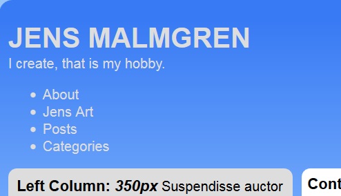
Now it is time for creating the main menu. It is going to be a menu with not so many items were each item can be short in text. This is suitable for some stylish menu. This is what I am going to make:
Now I will tell you how I created this, it is a wonderful story because it tells you how much you can do with CSS without images and JavaScript. I make this tab page menu from scratch myself and I don’t use anybody else template. It all starts with a simple bullet list like this:
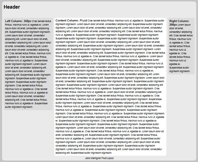
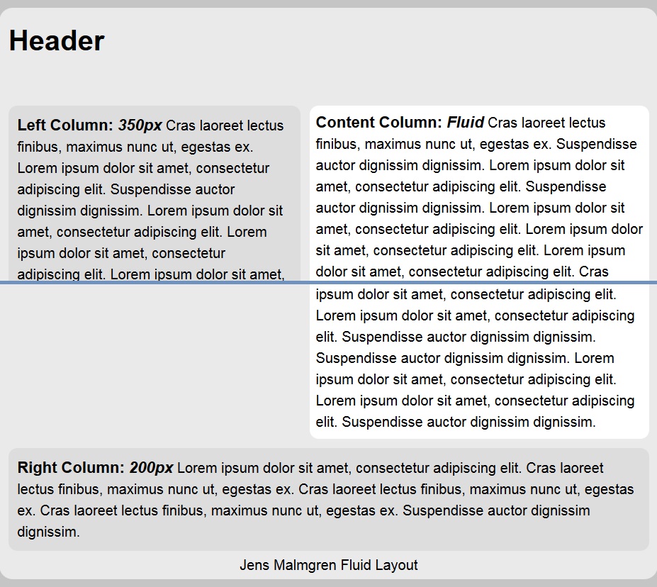
≺body≻
	≺div id="maincontainer"≻
		≺div id ="top"≻
			≺h1≻
				JENS MALMGREN
			≺/h1≻
			I create, that is my hobby.
			≺ul≻
				≺li≻≺a≻About≺/a≻≺/li≻
				≺li class = "selected"≻≺a≻Jens Art≺/a≻≺/li≻
				≺li≻≺a≻Posts≺/a≻≺/li≻
				≺li≻≺a≻Categories≺/a≻≺/li≻
			≺/ul≻
		≺/div≻
		≺div id="contentwrapper"≻
			≺div id="contentcolumn"≻
				≺b≻Content Column: ≺em≻Fluid≺/em≻≺/b≻ ≺script type="text/javascript"≻filltext(45)≺/script≻
			≺/div≻
		≺/div≻
		≺div id="leftcolumn"≻
			≺div class="innertube"≻≺b≻Left Column: ≺em≻350px≺/em≻≺/b≻ ≺script type="text/javascript"≻filltext(20)≺/script≻≺/div≻
		≺/div≻
		≺div id="rightcolumn"≻
			≺div class="innertube"≻≺b≻Right Column: ≺em≻200px≺/em≻≺/b≻ ≺script type="text/javascript"≻filltext(5)≺/script≻≺/div≻
		≺/div≻
		≺div id="foot"≻Copyright © 2015, Jens Malmgren≺/div≻
	≺/div≻
≺/body≻
This here is how it looks like initially after adding the bullet list:
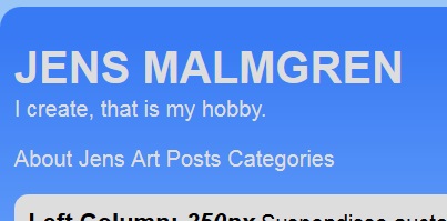
First I need to remove the space before the texts where the bullets are, padding: 0; and I want all the items to be their own block on a line as if they were words in a text, display: inline-block.
#top ul
{    list-style-type: none;
     padding:0;
}
#top ul li
{
     display: inline-block;
}
Then it looks like this:
First I want to change each item to look like a tab of a tab page so I give them a blue background. The selected item needs to look different. I want it to have the same color white as the background of the content it later will be connected to.
#top ul li a
{
    white-space: nowrap;
    border-radius: 5px 5px 0 0;
    padding: 4px 4px 3px 4px;
    font-weight: bold;
    background: #A0BFFA;
    color:#777777;
}

#top ul li.selected a
{
    color:#000;
    background: #fff;
    padding: 4px 4px 15px 4px;
}
Now it starts looking like tabs of tabpages. But the list is not at the top of the contentwrapper area, it is above the right sidebar. To fix this we need to add a left margin of 350px to the #top ul rules.
margin: 0 7px 0 350px;
The right margin of 7px we will need when the entire list is bumping into the edge of the screen on the right side, there has to be a bit of a buffer to the edge of the screen. Maybe you wonder how I remember what is what of these four slots of margin widths. It starts at the top position. The first item of the list of margin widths when there are four of them is always the top margin. Then it goes on with the right margin and so on all the way around. The good thing is that padding four sides are the same.
What I am aiming for here is that the selected tab will be higher than the other tabs that aren’t selected so I need to increase the height of the whole #top ul element. I add this rule to #top ul:
height:30px;
This is the result:
Now I can insert a new line in the "#top ul li.selected a" rule list:
position:relative;
top:-6px;
By doing this the top of the selected item is -6px higher.
Now if the window is narrower the menu items are stacked on each other.
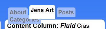
To solve that I decide that I want one line of menu items and the items that cannot be visible they will be hidden.
In the "#top ul" rule list I add these rules:
overflow: hidden;
white-space:no-wrap;
line-height:40px;
And by doing this I also get rid of some unnecessary extra white of the tab. And the tab lines up nicely on one row with the content wrapper object and as I said, items that cannot be displayed they are hidden.
This is already very nice but I want some extra. I want that the tab is better "connected" with the object below. To do that I decided to add rounded inverted corners between the tab and the contentwrapper object.
#top ul li.selected::before
{
    content:" ";
    display:inline-block;
    width:5px;
    height:5px;
    border:1px solid purple;
}

#top ul li.selected::after
{
    content:" ";
    display:inline-block;
    width:5px;
    height:5px;
    border:1px solid yellow;
}
To do this I use the construction ::before and ::after to create new objects in the html before and after the selected list item. With these new objects in place I simply made them 5px by 5px and gave them a border so that we can see them.
The new objects are placed slightly to high. To correct this I add the following two rules to both the before and the after rule:
position:relative;
bottom:-5px;
With that the new before and after objects are firmly placed in the corner between the tab and the text:
With that I remove the border from the before rule list. Instead I add a new rule creating a gradient "painting" the inner inverted corner of the tab page.
background-image: radial-gradient(farthest-corner at 0px 0px, transparent 70%, #fff 70%);
And likewise for the after rule list I remove the border rule and insert the opposit gradient painting rule:
background-image: radial-gradient(farthest-corner at 5px 0px, transparent 70%, #fff 70%);
And now the result looks like this:
This all very well but the active tab is higher and wider than the rest and it will look a little bit strange when switching between the pages. It would be better if all tab pages had the same width when they are selected as well as when they are inactive. To do this we need before and after rules for all inactive tabs but obviously not for the selected tab. Like this:
#top ul li:not(.selected)::before
{
    content:" ";
    display:inline-block;
    position:relative;
    left:0;
    bottom:-5px;≺br /≻    width:5px;≺br /≻    height:5px;≺br /≻    background-image: radial-gradient(farthest-corner at 0px 0px, transparent 70%, #A0BFFA 70%);≺br /≻}≺br /≻≺br /≻#top ul li:not(.selected)::after≺br /≻{≺br /≻    content:" ";≺br /≻    display:inline-block;≺br /≻    position:relative;≺br /≻    right:0;≺br /≻    bottom:-5px;≺br /≻    width:5px;≺br /≻    height:5px;≺br /≻    background-image: radial-gradient(farthest-corner at 5px 0px, transparent 70%, #A0BFFA 70%);≺br /≻}
And here almost got the final result:
What do we have between the items? If we go back to the beginning we had an extra space between every item and it is still there inbetween the items. What is that space? It is the space between the list items. This was the original ul list:
≺ul≻≺br /≻ ≺li≻≺a≻About≺/a≻≺/li≻≺br /≻ ≺li class = "selected"≻≺a≻Jens Art≺/a≻≺/li≻≺br /≻ ≺li≻≺a≻Posts≺/a≻≺/li≻≺br /≻ ≺li≻≺a≻Categories≺/a≻≺/li≻≺br /≻≺/ul≻
Normally we don’t need to bother what happens between the lines of list items but now when we turned the list into a set of words and if we have newlines and tabs and other spaces between the items then those spaces will be visible. So to solve this we remove all white space between the list items.
And hereby the layout for the tab page is finished. Almost! When hovering over an item we need to display it differently so that the user understands that it could be clicked to be activated.
#top ul li:not(.selected) a:hover≺br /≻{≺br /≻ white-space: nowrap;≺br /≻ border-radius: 5px 5px 0 0;≺br /≻ padding: 4px 4px 3px 4px;≺br /≻ font-weight: bold;≺br /≻ background: #E2ECFE;≺br /≻ color:#575757;≺br /≻ cursor:pointer;≺br /≻}
So the hovered item is lighter and the text is darker.
When the user clicked the tab that moment it is clicked it should light up in orange.
#top ul li:not(.selected) a:active≺br /≻{≺br /≻ white-space: nowrap;≺br /≻ border-radius: 5px 5px 0 0;≺br /≻ padding: 4px 4px 3px 4px;≺br /≻ font-weight: bold;≺br /≻ background: #FFBF00;≺br /≻ color:#2C2C2C;≺br /≻ cursor:pointer;≺br /≻} ≺br /≻≺br /≻
Here is how the entire html file looks like.
≺!DOCTYPE html PUBLIC "-//W3C//DTD HTML 4.01//EN" "http://www.w3.org/TR/html4/strict.dtd"≻
≺html≻
≺head≻
≺meta charset="utf-8" /≻
≺meta name="viewport" content="width=device-width, initial-scale=1"≻
≺title≻Jens Fluid Blog Layout≺/title≻
	≺style type="text/css"≻
		html
		{
			background-color: #99c6f7;
		}
		body
		{
			margin:0;
			padding:0;
			font-family: arial,sans-serif;
		}

		#maincontainer
		{
			border-radius:15px;

/* Permalink - use to edit and share this gradient: http://colorzilla.com/gradient-editor/#387af4+3,98c9ff+54,c6b3c7+68,c492b8+74,8068bc+80,4b68c6+88,010626+93,2553a5+98 */
background: #387af4; /* Old browsers */
background: -moz-linear-gradient(top,  #387af4 3%, #98c9ff 54%, #c6b3c7 68%, #c492b8 74%, #8068bc 80%, #4b68c6 88%, #010626 93%, #2553a5 98%); /* FF3.6+ */
background: -webkit-gradient(linear, left top, left bottom, color-stop(3%,#387af4), color-stop(54%,#98c9ff), color-stop(68%,#c6b3c7), color-stop(74%,#c492b8), color-stop(80%,#8068bc), color-stop(88%,#4b68c6), color-stop(93%,#010626), color-stop(98%,#2553a5)); /* Chrome,Safari4+ */
background: -webkit-linear-gradient(top,  #387af4 3%,#98c9ff 54%,#c6b3c7 68%,#c492b8 74%,#8068bc 80%,#4b68c6 88%,#010626 93%,#2553a5 98%); /* Chrome10+,Safari5.1+ */
background: -o-linear-gradient(top,  #387af4 3%,#98c9ff 54%,#c6b3c7 68%,#c492b8 74%,#8068bc 80%,#4b68c6 88%,#010626 93%,#2553a5 98%); /* Opera 11.10+ */
background: -ms-linear-gradient(top,  #387af4 3%,#98c9ff 54%,#c6b3c7 68%,#c492b8 74%,#8068bc 80%,#4b68c6 88%,#010626 93%,#2553a5 98%); /* IE10+ */
background: linear-gradient(to bottom,  #387af4 3%,#98c9ff 54%,#c6b3c7 68%,#c492b8 74%,#8068bc 80%,#4b68c6 88%,#010626 93%,#2553a5 98%); /* W3C */
filter: progid:DXImageTransform.Microsoft.gradient( startColorstr=’#387af4’, endColorstr=’#2553a5’,GradientType=0 ); /* IE6-9 */

			max-width:1300px;
			margin: 10px auto;
		}
		b{font-size: 110%;}
		#top
		{
			color:#DDDDDD;
			padding:10px 10px 0 10px;
		}
		#top h1
		{
			margin: 0;
			padding-top: 15px;
		}
		#contentwrapper
		{
			float: left;
			width: 100%;
		}
		#contentcolumn
		{
			margin: 0 200px 0 350px;
			background-color:#fff;
			border-radius:10px;
			padding:7px;
		}
		#leftcolumn
		{
			float: left;
			width: 350px;
			margin-left: -100%;
		}
		#rightcolumn
		{
			float: left;
			width: 200px;
			margin-left: -200px;
		}
		#foot
		{
			clear: left;
			width: 100%;
			text-align: center;
			padding: 4px 0;
			color:#DDDDDD;
			font-weight:bold;
		}
		@media (min-width: 900px)
		{
			.innertube
			{
				background: #DDDDDD;
				border-radius:10px;
				padding:10px;
				margin: 0 10px 10px 10px;
			}
		}
		#top ul
		{
			list-style-type: none;
			margin: 0 7px 0 350px;
			height:30px;
			padding:0;
			overflow: hidden;
			white-space:no-wrap;
			line-height:40px;
		}

		#top ul li
		{
			display: inline-block;
		}

		#top ul li a
		{
			white-space: nowrap;
			border-radius: 5px 5px 0 0;
			padding: 4px 4px 3px 4px;
			font-weight: bold;
			background: #A0BFFA;
			color:#777777;
		}

		#top ul li:not(.selected) a:hover
		{
			white-space: nowrap;
			border-radius: 5px 5px 0 0;
			padding: 4px 4px 3px 4px;
			font-weight: bold;
			background: #E2ECFE;
			color:#575757;
			cursor:pointer;
		}

		#top ul li:not(.selected) a:active
		{
			white-space: nowrap;
			border-radius: 5px 5px 0 0;
			padding: 4px 4px 3px 4px;
			font-weight: bold;
			background: #FFBF00;
			color:#2C2C2C;
			cursor:pointer;
		}

		#top ul li.selected a
		{
			color:#000;
			position:relative;
			top:-6px;
			background: #fff;
			padding: 4px 4px 15px 4px;
		}

		#top ul li.selected::before
		{
			content:" ";
			display:inline-block;
			position:relative;
			bottom:-5px;
			width:5px;
			height:5px;
			background-image: radial-gradient(farthest-corner at 0px 0px, transparent 70%, #fff 70%);
		}

		#top ul li.selected::after
		{
			content:" ";
			display:inline-block;
			position:relative;
			bottom:-5px;
			width:5px;
			height:5px;
			background-image: radial-gradient(farthest-corner at 5px 0px, transparent 70%, #fff 70%);
		}

		#top ul li:not(.selected)::before
		{
			content:" ";
			display:inline-block;
			position:relative;
			left:0;
			bottom:-5px;
			width:5px;
			height:5px;
			background-image: radial-gradient(farthest-corner at 0px 0px, transparent 70%, #A0BFFA 70%);
		}

		#top ul li:not(.selected)::after
		{
			content:" ";
			display:inline-block;
			position:relative;
			right:0;
			bottom:-5px;
			width:5px;
			height:5px;
			background-image: radial-gradient(farthest-corner at 5px 0px, transparent 70%, #A0BFFA 70%);
		}
		@media (min-width: 600px) and (max-width: 900px){
			#leftcolumn
			{
				margin-left: -100%;
			}
			#leftcolumn .innertube
			{
				background: #DDDDDD;
				border-radius:10px;
				padding:10px;
				margin: 0 10px 10px 10px;
			}
			#rightcolumn
			{
				float: auto;
				width: auto;
				margin-left: auto;
				clear: both;
				padding: 10px 10px 0 10px;
			}
			#rightcolumn .innertube
			{
				background: #DDDDDD;
				border-radius:10px;
				padding:10px;
			}
			#contentcolumn
			{
				margin-right: 10px;
			}
		}
		@media (max-width: 600px)
		{
			#top h1
			{
				display:inline-block;
				margin: 0;
				padding-top: 15px;
				font-size:1.2em;
			}
			#leftcolumn
			{
				width: 100%;
				float: auto;
				clear: both;
				margin-left: 0;
				margin:0;
			}
			#leftcolumn .innertube
			{
				background: #DDDDDD;
				border-radius:10px;
				padding:10px;
				margin: 0 10px 10px 10px;
			}
			#leftcolumn .innertube
			{
				margin: 10px 10px 0 10px;
			}
			#rightcolumn
			{
				float: left;
				padding-top: 0 10px 30px 10px;
				float: auto;
				width: auto;
				margin-left: auto;
				clear: both;
				padding: 10px 10px 0 10px;
			}
			#rightcolumn .innertube
			{
				background: #DDDDDD;
				border-radius:10px;
				padding:10px;
			}
			#contentcolumn
			{
				margin: 0 10px 0 10px;
			}

			#top ul
			{
				margin: 0 0 0 7px !Important;
			}
		}

	≺/style≻
	≺script type="text/javascript"≻
	var strLorem = ["Lorem ipsum dolor sit amet, consectetur adipiscing elit.", "Cras laoreet lectus finibus, maximus nunc ut, egestas ex.", "Suspendisse auctor dignissim dignissim."];
	function filltext(words)
	{
		for (var i=0; i≺words; i++) document.write(strLorem[Math.floor(Math.random()*3)]+" ");
	}
	≺/script≻
≺/head≻
≺body≻
	≺div id="maincontainer"≻
		≺div id ="top"≻
			≺h1≻
				JENS MALMGREN
			≺/h1≻
			I create, that is my hobby.
			≺ul≻
				≺li≻≺a≻About≺/a≻≺/li≻≺li class = "selected"≻≺a≻Jens Art≺/a≻≺/li≻≺li≻≺a≻Posts≺/a≻≺/li≻≺li≻≺a≻Categories≺/a≻≺/li≻
			≺/ul≻
		≺/div≻
		≺div id="contentwrapper"≻
			≺div id="contentcolumn"≻
				≺b≻Content Column: ≺em≻Fluid≺/em≻≺/b≻ ≺script type="text/javascript"≻filltext(45)≺/script≻
			≺/div≻
		≺/div≻
		≺div id="leftcolumn"≻
			≺div class="innertube"≻≺b≻Left Column: ≺em≻350px≺/em≻≺/b≻ ≺script type="text/javascript"≻filltext(20)≺/script≻≺/div≻
		≺/div≻
		≺div id="rightcolumn"≻
			≺div class="innertube"≻≺b≻Right Column: ≺em≻200px≺/em≻≺/b≻ ≺script type="text/javascript"≻filltext(5)≺/script≻≺/div≻
		≺/div≻
		≺div id="foot"≻Copyright © 2015, Jens Malmgren≺/div≻
	≺/div≻
≺/body≻
≺/html≻
That’s it for now. Next time I will work on controls for going to the previous and next blog post.

 Sounds in the blogsystemNext version of the slideshowLearning Python Part IIILearning Python Part IIImpressionism and beyond. A Wonderful Journey 28 January 2018Fixing unresolved links after editingThis is my summer 2016 blog!Porting my blog for the second time, linksPorting my blog for the second time, editing part 7Porting my blog for the second time, editing part 6Porting my blog for the second time, categories part 3Business cards, version 1Porting my blog for the second time, deployment part 2Not indexed but still missing? Google hypocrisy.A new era: Nikon D5100 DSLR, Nikkor 18 - 55 and 55 - 300!
 I moved from Sweden to The Netherlands in 1995.
Here on this site, you find my creations because that is what I do. I create.