| Porting my blog for the second time, setting up Apache2 |
Porting my blog for the second time, layout part 2 |
Porting my blog for the second time, create a layout
This is post #19 of my series about how I port this blog from Blogengine.NET 2.5 ASPX on a Windows Server 2003 to a Linux Ubuntu server, Apache2, MySQL and PHP. A so called LAMP. The introduction to this project can be found in this blog post https://www.malmgren.nl/post/Porting-my-blog-for-the-second-time-Project-can-start.aspx.
To present my blog I need to put it into an html page. That page will have a layout and I want it to be fully dynamic. It need to be one layout working on mobile phones as well as huge mega monitors. This is called responsive design, liquid design, fluid design and so on.
When I searched for "css two sidebars responsive design" I got several pages with tips for how I should do it. Found a template that would do as a starting point: http://www.dynamicdrive.com/style/layouts/item/css_liquid_layout_32_fluid_fluid_fixed/.
I created a test document with the layout from the sample in the link as a starting point. Then I started tweaking to get thing to look my way.
They had a right column that was 25% of the total width. I changed that to a fixed width for the right column. They had no maximum width for the maincontainer. I changed it so that I had a max width of 1300 px. They had no extra space at the top so I added that small extra space. My greatest challenge though was that I wanted to use rounded corners in such way that the top of the page had rounded corners and the footer also had rounded corners. To achieve this I had to have a topback and footback with the same color as the window background and then inside these I had the same size item but with rounded corners.
The original layout had overlapping media definitions. That was hard to find out. There was a media definition for max width of 840px and when the screen was less than 600 both the 840 definition as well as the 600 definition was active and these two interacted in ways I could just barely understand.
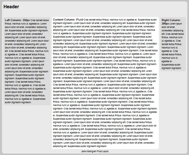
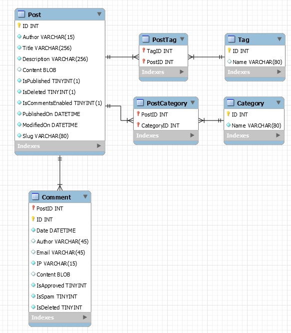
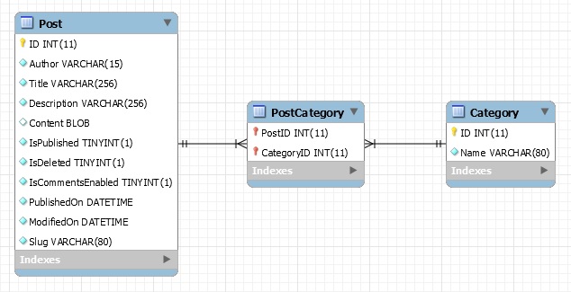
In the end I got something like this. This is for a full screen. Left and right sidebars. Main area. Header and footer.
Here is an example of the site when viewed in a two column state. The blue line here is where I cut the top half and bottom half of the screen, it is not visible in my layout.
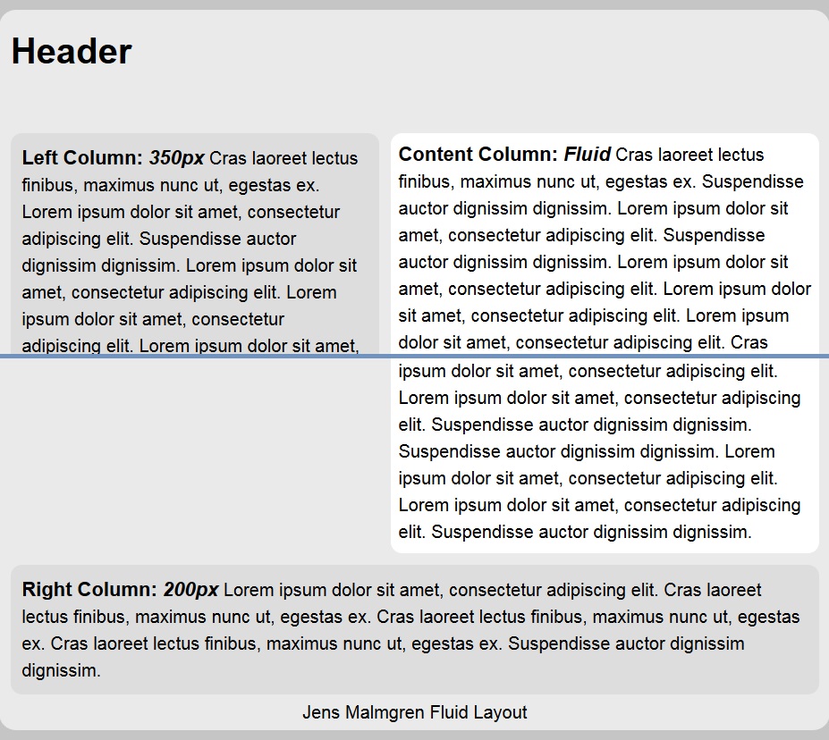
When the screen get narrower then there is a one column layout where the left and right sidebars are at the end of the page.
Here is the source of my test page so far:
≺!DOCTYPE html PUBLIC "-//W3C//DTD HTML 4.01//EN" "http://www.w3.org/TR/html4/strict.dtd"≻
≺html≻
≺head≻
≺meta charset="utf-8" /≻
≺meta name="viewport" content="width=device-width, initial-scale=1"≻
≺title≻Jens Fluid Blog Layout≺/title≻
	≺style type="text/css"≻
		body
		{
			margin:0;
			padding:0;
			line-height: 1.5em;
			background-color: #c5c5c5;
			font-family: arial,sans-serif;
		}
		#maincontainer
		{
			background-color:#EAEAEA;
			max-width:1300px;
			margin: 10px auto;
		}
		b{font-size: 110%;}
		#topback
		{
			background-color: #c5c5c5;
		}
		#topfront
		{
			background: #EAEAEA;
			height: 90px;
			border-radius:15px 15px 0 0;
			padding:10px;
		}
		#topfront h1
		{
			margin: 0;
			padding-top: 15px;
		}
		#contentwrapper
		{
			float: left;
			width: 100%;
		}
		#contentcolumn
		{
			margin: 0 200px 0 350px;
			background-color:#fff;
			border-radius:10px;
			padding:7px;
		}
		#leftcolumn
		{
			float: left;
			width: 350px;
			margin-left: -100%;
		}
		#rightcolumn
		{
			float: left;
			width: 200px;
			margin-left: -200px;
		}
		#footback
		{
			clear: left;
			width: 100%;
			background: #c5c5c5;
		}
		#foottop
		{
			clear: left;
			width: 100%;
			background: #EAEAEA;
			text-align: center;
			padding: 4px 0;
			border-radius:0 0 15px 15px;
		}
		@media (min-width: 840px)
		{
			.innertube
			{
				background: #DDDDDD;
				border-radius:10px;
				padding:10px;
				margin: 0 10px 10px 10px;
			}
		}
		@media (min-width: 600px) and (max-width: 840px){
			#leftcolumn
			{
				margin-left: -100%;
			}
			#leftcolumn .innertube
			{
				background: #DDDDDD;
				border-radius:10px;
				padding:10px;
				margin: 0 10px 10px 10px;
			}
			#rightcolumn
			{
				float: auto;
				width: auto;
				margin-left: auto;
				clear: both;
				background: #EAEAEA;
				padding: 10px 10px 0 10px;
			}
			#rightcolumn .innertube
			{
				background: #DDDDDD;
				border-radius:10px;
				padding:10px;
			}
			#contentcolumn
			{
				margin-right: 10px;
			}
		}
		@media (max-width: 600px)
		{
			#leftcolumn
			{
				width: 100%;
				float: auto;
				clear: both;
				margin-left: 0;
				margin:0;
				background: #EAEAEA;
			}
			#leftcolumn .innertube
			{
				background: #DDDDDD;
				border-radius:10px;
				padding:10px;
				margin: 0 10px 10px 10px;
			}
			#leftcolumn .innertube
			{
				margin: 10px 10px 0 10px;
			}
			#rightcolumn
			{
				float: left;
				padding-top: 0 10px 30px 10px;
				float: auto;
				width: auto;
				margin-left: auto;
				clear: both;
				background: #EAEAEA;
				padding: 10px 10px 0 10px;
			}
			#rightcolumn .innertube
			{
				background: #DDDDDD;
				border-radius:10px;
				padding:10px;
			}
			#contentcolumn
			{
				margin: 0 10px 0 10px;
			}
		}
	≺/style≻
	≺script type="text/javascript"≻
	var strLorem = ["Lorem ipsum dolor sit amet, consectetur adipiscing elit.", "Cras laoreet lectus finibus, maximus nunc ut, egestas ex.", "Suspendisse auctor dignissim dignissim."];
	function filltext(words)
	{
		for (var i=0; i≺words; i++) document.write(strLorem[Math.floor(Math.random()*3)]+" ");
	}
	≺/script≻
≺/head≻
≺body≻
	≺div id="maincontainer"≻
		≺div id ="topback"≻
			≺div id="topfront"≻
				≺h1≻
					Header
				≺/h1≻
			≺/div≻
		≺/div≻
		≺div id="contentwrapper"≻
			≺div id="contentcolumn"≻
				≺b≻Content Column: ≺em≻Fluid≺/em≻≺/b≻ ≺script type="text/javascript"≻filltext(80)≺/script≻
			≺/div≻
		≺/div≻
		≺div id="leftcolumn"≻
			≺div class="innertube"≻≺b≻Left Column: ≺em≻350px≺/em≻≺/b≻ ≺script type="text/javascript"≻filltext(20)≺/script≻≺/div≻
		≺/div≻
		≺div id="rightcolumn"≻
			≺div class="innertube"≻≺b≻Right Column: ≺em≻200px≺/em≻≺/b≻ ≺script type="text/javascript"≻filltext(5)≺/script≻≺/div≻
		≺/div≻
		≺div id = "footback"≻
			≺div id="foottop"≻Jens Malmgren Fluid Layout≺/div≻
		≺/div≻
	≺/div≻
≺/body≻
≺/html≻
This is a really dull and gray layout. Now I would like to add some nice colors and maybe main menu elements. But that is for the next time.

 Sounds in the blogsystemNext version of the slideshowLearning Python Part IIILearning Python Part IIImpressionism and beyond. A Wonderful Journey 28 January 2018Fixing unresolved links after editingThis is my summer 2016 blog!Porting my blog for the second time, linksPorting my blog for the second time, editing part 7Porting my blog for the second time, editing part 6Porting my blog for the second time, categories part 3Business cards, version 1Porting my blog for the second time, deployment part 2Not indexed but still missing? Google hypocrisy.A new era: Nikon D5100 DSLR, Nikkor 18 - 55 and 55 - 300!
 I moved from Sweden to The Netherlands in 1995.
Here on this site, you find my creations because that is what I do. I create.